

Case Study
Making fashion personal with generative AI
Designing a scalable virtual try-on platform for online e-commerce

AI

Web

Mobile
SUMMARY
I designed and built a generative-AI-powered virtual try-on platform that helps fashion brands turn existing catalogs into personalized shopping experiences. The work combined UX strategy, AI prototyping, Shopify integration, and reusable platform design, built so one core experience could scale across brands without a rebuild, with measurable lifts in shopper conversion and order value for participating brands.
ROLE
UX Design & Strategy, Creative Direction & AI Workflow
TEAM
Program Manager, Engineering Team
CUSTOMERS
THEO The Label (active), The Noli Shop (former)
COMPANY
Fiercely
YEAR
2026
The Problem

Fashion brands spend a lot on product content: photography, styling, campaign shoots. But shoppers still have to guess how something will actually look on them. That guesswork is a real source of hesitation, cart abandonment, and returns. Virtual try-on was the obvious idea to test.
The brief wasn't just "build a try-on feature," though. It was to build one AI shopping experience that could work across different fashion brands, each with different catalogs, visual identities, and merchandising approaches, without feeling generic or bolted-on for any of them. We'd start on Shopify but needed to assume it wouldn't stay there.
The core question I kept coming back to: how do we make one AI shopping platform feel native to every brand it's on?
Why I Started with Architecture, Not Screens
We'd already built web demos showcasing our AI capabilities for e-commerce sites, so the generation side had a head start. I started the actual design work with THEO, but from day one I treated it as something that had to port to other fashion brands, not a one-off build for them. That mindset shaped decisions early; before I could get attached to a THEO-specific solution, I was already asking whether it would hold up on a brand that looked nothing like THEO.
So before designing anything brand-specific, I broke the platform into reusable layers: catalog onboarding, AI workflow like models and prompts, core UX and the customized user interface. The core flow (Catalog → Try On → Generate → View → Share → Shop) stayed the same across brands. Everything a brand actually sees and controls, like identity, catalog, styling, content, and CTAs, lived in a separate layer that could change without touching the core workflow. In practice, we did adopt brand-specific requests as they came up, but implementation-side, each one could be flagged to the specific store it applied to, so a change for one brand didn't ripple into another.
Bringing It to Life: THEO The Label
THEO was the first brand to run through this architecture, and the platform is still live on their storefront today.
A few decisions mattered most here:
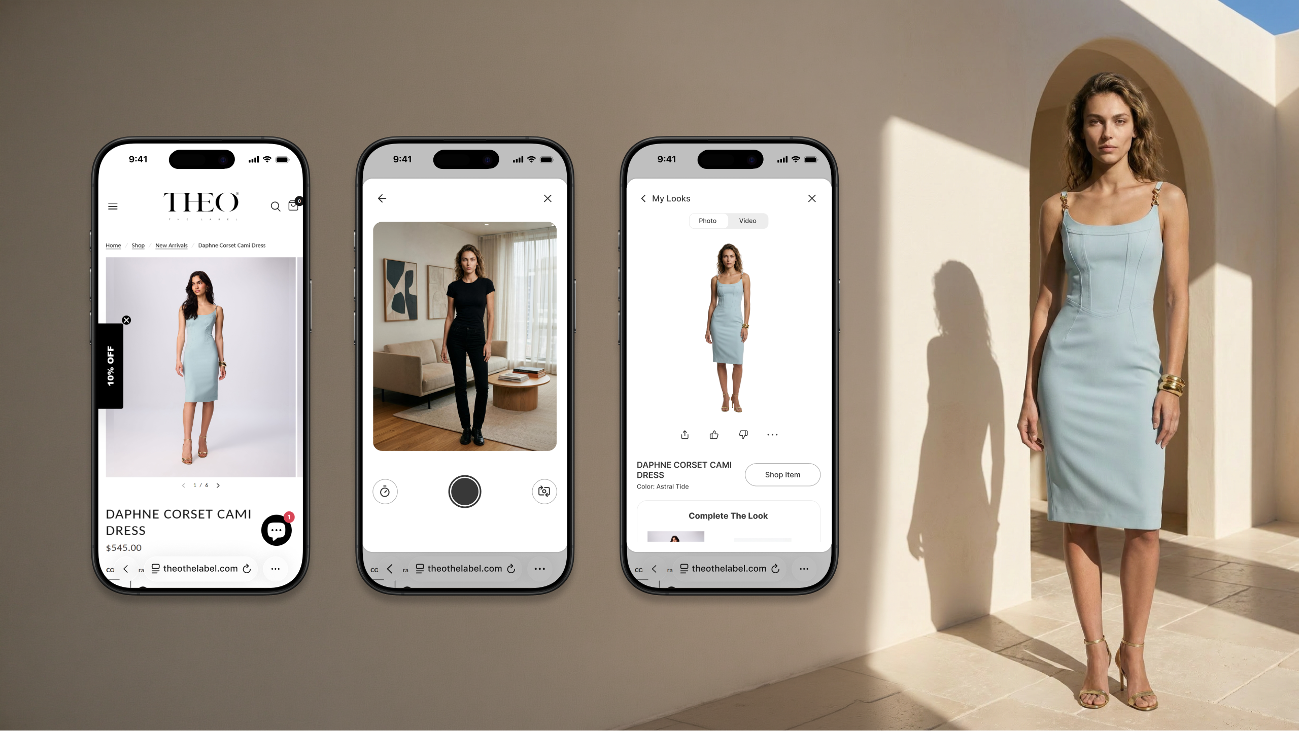
Try-on lives inside the shopping journey, not off to the side. It would've been easier to make VTO its own destination, but I kept it embedded: product page, then try-on in a modal, then an easy path back to the product page, then add to cart. The goal was to keep the way back to buying always one step away.
Personalization is the center of the experience, not a feature bolted onto it. A generated image of yourself in a garment functions differently than a stock product photo, so I gave results their own space and presented them as the sole focus of that screen, to give the moment a premium feel rather than treating it as a throwaway preview. Every result also saves to a "My Looks" page, so shoppers can come back and find their history instead of losing it after the session ends.
The result had to move, not just render. A static image only tells you so much about a garment. The result includes video: you see yourself moving, the fabric and garment moving with you, set against a background contextual to the outfit's theme. For most people, that's the moment the experience clicks. It's the closest thing to trying something on without actually trying it on, and it's consistently the part that gets the strongest reaction from users.
Generated content leads back to commerce. On the results screen, there's a clear path back to the product page, and below that, a "Complete the Look" section surfacing the other products used to assemble that result, helping shoppers discover items they might not have found on their own. It's become one of the most well-liked parts of the experience for customers.
The system is reusable by design, not by luck. The same try-on modal had to work convincingly on a different brand's site with only the entry content changing. That's really the test of whether the platform decisions held up: does a second brand feel first-class, or does it feel reskinned.
What Happened With Each Brand
We launched THEO's Shopify app, then reused the same core experience for a second brand, The Noli Shop (NOLI), within about a month, without rebuilding it. That's the part I care most about: the architecture held up on a second brand.
In a 30-day analysis window, shoppers who used the VTO feature converted to buyers at a meaningfully higher rate than those who didn't. Among buyers, VTO users also bought more — higher revenue per buyer, higher average order value, and more items and orders per person. The standout wasn't just higher conversion; it was that VTO users became higher-value shoppers overall, across both cart size and order frequency.
(Buyer economics were measured from each user's first engagement: first VTO session for VTO users, first product page visit for non-VTO users, compared over the same 30-day window. Specific figures are available on request.)
What I Took Away From This
AI product design is mostly systems design.
The screens are a small part of it. Most of the work is deciding what stays fixed and what's allowed to flex, across brands and catalogs and an AI capability that keeps changing.
Shoppers don't need to understand the AI.
They need to know if it worked. Once I stopped trying to explain generation and focused on helping people quickly judge whether a garment looked right and know what to do next, the design got simpler and more useful.
A launch matters more once it's repeated.
Shipping one good brand experience is one thing. Shipping something that adapts to a second brand in weeks instead of months, and that you can actually measure, is what makes it a platform rather than a one-off feature.
Imagery in this case study features THEO The Label, used with their permission. NOLI's results are included for context; brand imagery is withheld out of respect for the former partnership.
Check out THEO Virtual Try-On now
Go to THEO

More Case Studies
AI-Powered Collaboration Across Devices
Future of AI-powered collaboration and productivity across devices
View Case Study


Private
Spatial Scene Reader
Patented accessibility solution for low vision users in immersive meetings
View Case Study
Private
Media Triage in HoloLens 2
Spatial proof of concept to triage large volumes of media efficiently
View Case Study
Private
Case Study
Making fashion personal with generative AI
Designing a scalable virtual try-on platform for online e-commerce
AI
Web
Mobile
SUMMARY
I designed and built a generative-AI-powered virtual try-on platform that helps fashion brands turn existing catalogs into personalized shopping experiences. The work combined UX strategy, AI prototyping, Shopify integration, and reusable platform design, built so one core experience could scale across brands without a rebuild, with measurable lifts in shopper conversion and order value for participating brands.
ROLE
UX Design & Strategy, Creative Direction & AI Workflow
TEAM
Program Manager, Engineering Team
CUSTOMERS
THEO The Label (active), The Noli Shop (former)
COMPANY
Fiercely
YEAR
2026
The Problem

Fashion brands spend a lot on product content: photography, styling, campaign shoots. But shoppers still have to guess how something will actually look on them. That guesswork is a real source of hesitation, cart abandonment, and returns. Virtual try-on was the obvious idea to test.
The brief wasn't just "build a try-on feature," though. It was to build one AI shopping experience that could work across different fashion brands, each with different catalogs, visual identities, and merchandising approaches, without feeling generic or bolted-on for any of them. We'd start on Shopify but needed to assume it wouldn't stay there.
The core question I kept coming back to: how do we make one AI shopping platform feel native to every brand it's on?
Why I Started with Architecture, Not Screens
We'd already built web demos showcasing our AI capabilities for e-commerce sites, so the generation side had a head start. I started the actual design work with THEO, but from day one I treated it as something that had to port to other fashion brands, not a one-off build for them. That mindset shaped decisions early; before I could get attached to a THEO-specific solution, I was already asking whether it would hold up on a brand that looked nothing like THEO.
So before designing anything brand-specific, I broke the platform into reusable layers: catalog onboarding, AI workflow like models and prompts, core UX and the customized user interface. The core flow (Catalog → Try On → Generate → View → Share → Shop) stayed the same across brands. Everything a brand actually sees and controls, like identity, catalog, styling, content, and CTAs, lived in a separate layer that could change without touching the core workflow. In practice, we did adopt brand-specific requests as they came up, but implementation-side, each one could be flagged to the specific store it applied to, so a change for one brand didn't ripple into another.
Bringing It to Life: THEO The Label
THEO was the first brand to run through this architecture, and the platform is still live on their storefront today.
A few decisions mattered most here:
Try-on lives inside the shopping journey, not off to the side. It would've been easier to make VTO its own destination, but I kept it embedded: product page, then try-on in a modal, then an easy path back to the product page, then add to cart. The goal was to keep the way back to buying always one step away.
Personalization is the center of the experience, not a feature bolted onto it. A generated image of yourself in a garment functions differently than a stock product photo, so I gave results their own space and presented them as the sole focus of that screen, to give the moment a premium feel rather than treating it as a throwaway preview. Every result also saves to a "My Looks" page, so shoppers can come back and find their history instead of losing it after the session ends.
The result had to move, not just render. A static image only tells you so much about a garment. The result includes video: you see yourself moving, the fabric and garment moving with you, set against a background contextual to the outfit's theme. For most people, that's the moment the experience clicks. It's the closest thing to trying something on without actually trying it on, and it's consistently the part that gets the strongest reaction from users.
Generated content leads back to commerce. On the results screen, there's a clear path back to the product page, and below that, a "Complete the Look" section surfacing the other products used to assemble that result, helping shoppers discover items they might not have found on their own. It's become one of the most well-liked parts of the experience for customers.
The system is reusable by design, not by luck. The same try-on modal had to work convincingly on a different brand's site with only the entry content changing. That's really the test of whether the platform decisions held up: does a second brand feel first-class, or does it feel reskinned.
What Happened With Each Brand
We launched THEO's Shopify app, then reused the same core experience for a second brand, The Noli Shop (NOLI), within about a month, without rebuilding it. That's the part I care most about: the architecture held up on a second brand.
In a 30-day analysis window, shoppers who used the VTO feature converted to buyers at a meaningfully higher rate than those who didn't. Among buyers, VTO users also bought more — higher revenue per buyer, higher average order value, and more items and orders per person. The standout wasn't just higher conversion; it was that VTO users became higher-value shoppers overall, across both cart size and order frequency.
(Buyer economics were measured from each user's first engagement: first VTO session for VTO users, first product page visit for non-VTO users, compared over the same 30-day window. Specific figures are available on request.)
What I Took Away From This
AI product design is mostly systems design.
The screens are a small part of it. Most of the work is deciding what stays fixed and what's allowed to flex, across brands and catalogs and an AI capability that keeps changing.
Shoppers don't need to understand the AI.
They need to know if it worked. Once I stopped trying to explain generation and focused on helping people quickly judge whether a garment looked right and know what to do next, the design got simpler and more useful.
A launch matters more once it's repeated.
Shipping one good brand experience is one thing. Shipping something that adapts to a second brand in weeks instead of months, and that you can actually measure, is what makes it a platform rather than a one-off feature.
Imagery in this case study features THEO The Label, used with their permission. NOLI's results are included for context; brand imagery is withheld out of respect for the former partnership.
Check out THEO Virtual Try-On now
Go to THEO
More Case Studies
AI-Powered Collaboration Across Devices
Future of AI-powered collaboration and productivity across devices
View Case Study
Private
Spatial Scene Reader
Patented accessibility solution for low vision users in immersive meetings
View Case Study
Private
Media Triage in HoloLens 2
Spatial proof of concept to triage large volumes of media efficiently
View Case Study
Private
Case Study
Making fashion personal with generative AI
Designing a scalable virtual try-on platform for online e-commerce
AI
Web
Mobile
SUMMARY
I designed and built a generative-AI-powered virtual try-on platform that helps fashion brands turn existing catalogs into personalized shopping experiences. The work combined UX strategy, AI prototyping, Shopify integration, and reusable platform design, built so one core experience could scale across brands without a rebuild, with measurable lifts in shopper conversion and order value for participating brands.
ROLE
UX Design & Strategy, Creative Direction & AI Workflow
TEAM
Program Manager, Engineering Team
CUSTOMERS
THEO The Label (active), The Noli Shop (former)
COMPANY
Fiercely
YEAR
2026
The Problem

Fashion brands spend a lot on product content: photography, styling, campaign shoots. But shoppers still have to guess how something will actually look on them. That guesswork is a real source of hesitation, cart abandonment, and returns. Virtual try-on was the obvious idea to test.
The brief wasn't just "build a try-on feature," though. It was to build one AI shopping experience that could work across different fashion brands, each with different catalogs, visual identities, and merchandising approaches, without feeling generic or bolted-on for any of them. We'd start on Shopify but needed to assume it wouldn't stay there.
The core question I kept coming back to: how do we make one AI shopping platform feel native to every brand it's on?
Why I Started with Architecture, Not Screens
We'd already built web demos showcasing our AI capabilities for e-commerce sites, so the generation side had a head start. I started the actual design work with THEO, but from day one I treated it as something that had to port to other fashion brands, not a one-off build for them. That mindset shaped decisions early; before I could get attached to a THEO-specific solution, I was already asking whether it would hold up on a brand that looked nothing like THEO.
So before designing anything brand-specific, I broke the platform into reusable layers: catalog onboarding, AI workflow like models and prompts, core UX and the customized user interface. The core flow (Catalog → Try On → Generate → View → Share → Shop) stayed the same across brands. Everything a brand actually sees and controls, like identity, catalog, styling, content, and CTAs, lived in a separate layer that could change without touching the core workflow. In practice, we did adopt brand-specific requests as they came up, but implementation-side, each one could be flagged to the specific store it applied to, so a change for one brand didn't ripple into another.
Bringing It to Life: THEO The Label
THEO was the first brand to run through this architecture, and the platform is still live on their storefront today.
A few decisions mattered most here:
Try-on lives inside the shopping journey, not off to the side. It would've been easier to make VTO its own destination, but I kept it embedded: product page, then try-on in a modal, then an easy path back to the product page, then add to cart. The goal was to keep the way back to buying always one step away.
Personalization is the center of the experience, not a feature bolted onto it. A generated image of yourself in a garment functions differently than a stock product photo, so I gave results their own space and presented them as the sole focus of that screen, to give the moment a premium feel rather than treating it as a throwaway preview. Every result also saves to a "My Looks" page, so shoppers can come back and find their history instead of losing it after the session ends.
The result had to move, not just render. A static image only tells you so much about a garment. The result includes video: you see yourself moving, the fabric and garment moving with you, set against a background contextual to the outfit's theme. For most people, that's the moment the experience clicks. It's the closest thing to trying something on without actually trying it on, and it's consistently the part that gets the strongest reaction from users.
Generated content leads back to commerce. On the results screen, there's a clear path back to the product page, and below that, a "Complete the Look" section surfacing the other products used to assemble that result, helping shoppers discover items they might not have found on their own. It's become one of the most well-liked parts of the experience for customers.
The system is reusable by design, not by luck. The same try-on modal had to work convincingly on a different brand's site with only the entry content changing. That's really the test of whether the platform decisions held up: does a second brand feel first-class, or does it feel reskinned.
What Happened With Each Brand
We launched THEO's Shopify app, then reused the same core experience for a second brand, The Noli Shop (NOLI), within about a month, without rebuilding it. That's the part I care most about: the architecture held up on a second brand.
In a 30-day analysis window, shoppers who used the VTO feature converted to buyers at a meaningfully higher rate than those who didn't. Among buyers, VTO users also bought more — higher revenue per buyer, higher average order value, and more items and orders per person. The standout wasn't just higher conversion; it was that VTO users became higher-value shoppers overall, across both cart size and order frequency.
(Buyer economics were measured from each user's first engagement: first VTO session for VTO users, first product page visit for non-VTO users, compared over the same 30-day window. Specific figures are available on request.)
What I Took Away From This
AI product design is mostly systems design.
The screens are a small part of it. Most of the work is deciding what stays fixed and what's allowed to flex, across brands and catalogs and an AI capability that keeps changing.
Shoppers don't need to understand the AI.
They need to know if it worked. Once I stopped trying to explain generation and focused on helping people quickly judge whether a garment looked right and know what to do next, the design got simpler and more useful.
A launch matters more once it's repeated.
Shipping one good brand experience is one thing. Shipping something that adapts to a second brand in weeks instead of months, and that you can actually measure, is what makes it a platform rather than a one-off feature.
Imagery in this case study features THEO The Label, used with their permission. NOLI's results are included for context; brand imagery is withheld out of respect for the former partnership.
Check out THEO Virtual Try-On now
Go to THEO
More Case Studies
AI-Powered Collaboration Across Devices
Future of AI-powered collaboration and productivity across devices
View Case Study
Private
Spatial Scene Reader
Patented accessibility solution for low vision users in immersive meetings
View Case Study
Private
Media Triage in HoloLens 2
Spatial proof of concept to triage large volumes of media efficiently
View Case Study
Private